LinkedIn Growth Analysis


Background:
Inspired by a problem statement on Upwork, though not this. An advert was placed for a data scientist that could analyze interconnection between connections in one's network. It gave me an idea to analyze my LinkedIn growth, searched online and found this repo by Guillaume Chevalier.
Data Acquisition:
Navigated to my LinkedIn profile, went to settings then privacy setting to get my data. It took 13 minutes before I was notified that it was ready. The file I got was in .txt, I had to use an online extractor for it, probably because I requested for more than my connections dataset.
Data Preprocessing:
I followed through with what Chavalier did by swapping connected on with connected though it wasn't the variable he used.
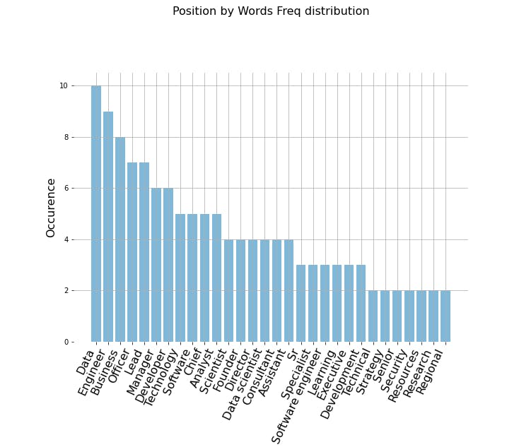
Then I set my desired size of image to be shown, the color, font and days of the week to enable me view the number of connections per day. Then I defined what the bar chart and plot should look like. Finally, I used the vectorizers to get the frequency of key words associated with my connections.
Data Visualization:
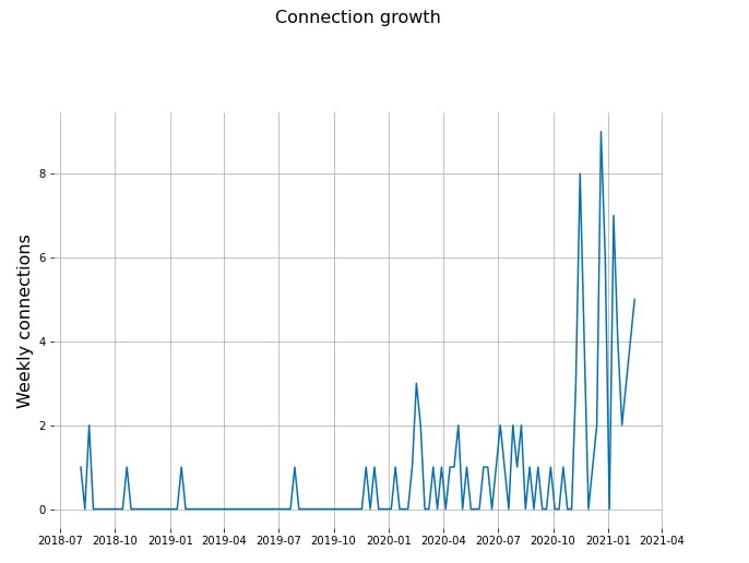
Visualizing my connection growth over the period of four years which was when I joined LinkedIn.
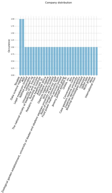
Visualizing my connections based on the companies where they work
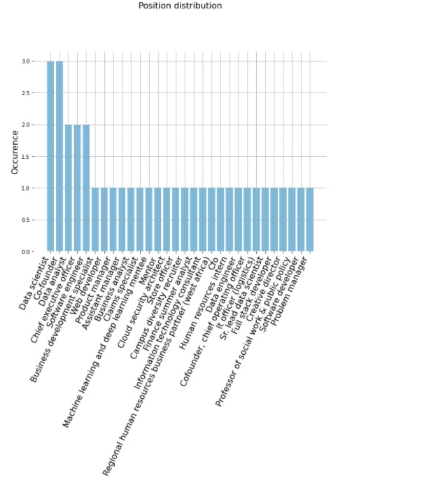
Visualizing based on their roles/positions in their respective companies
Finally visualizing the key words associated with them
Conclusion:
This is the repo to this mini-project. You can connect with me on LinkedIn and Twitter . Thank you for reading.